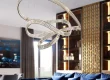
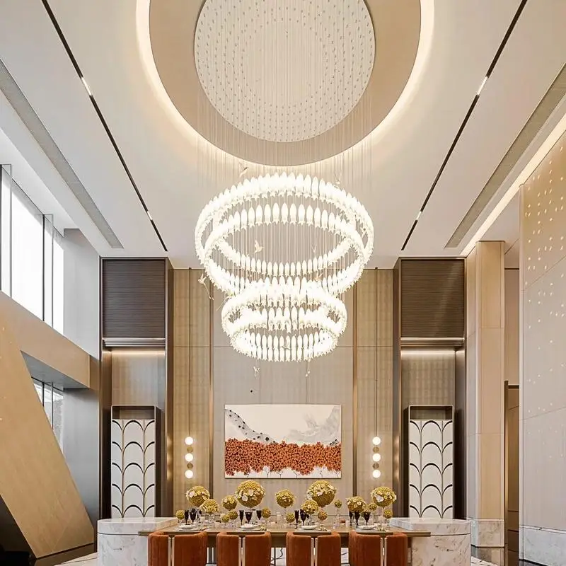
In commercial spaces, hotels, office buildings, or residential projects, lighting is more than just illumination; it’s a crucial means of creating ambiance and enhancing the experience. Color temperature is one of the key factors influencing the feeling of a space. For project purchasers or designers, understanding color temperature is essential for lighting fixture selection and spatial design.
1. What is Color Temperature?
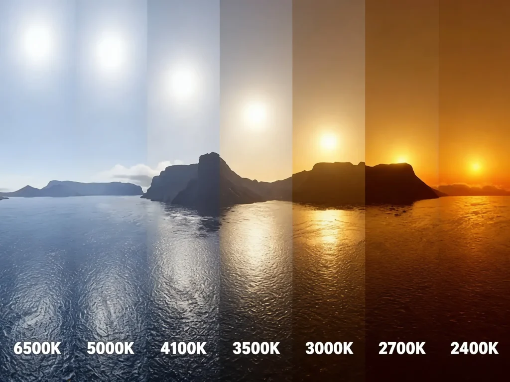
Color temperature is an indicator that measures whether the color of a light source is warm or cool, and its unit is Kelvin (K).
Warm White: Approx. 2700K–3000K
- The light has a yellowish tint, giving a warm and comfortable feeling.
- Suitable for spaces emphasizing a warm atmosphere, such as restaurants, hotel rooms, and homes.
Neutral White: Approx. 3500K–4000K
- The light color is close to natural light, balancing warm and cool tones.
- Suitable for places where accurate color reproduction of objects is needed, such as offices, meeting rooms, and retail stores.
Cool White: Approx. 5000K–6500K
- The light has a bluish tint, appearing crisp and bright.
- Suitable for environments requiring high attention or emphasizing cleanliness, such as factories, hospitals, and exhibition spaces.
🔹 For B2B clients, color temperature selection not only affects visual perception but also directly relates to user experience, brand image, and project costs.
| Color Temperature Range | Visual Effects | User Sentiment/Behavior | Most Suitable B2B Scenarios | Summary |
| 2700K–3000K | Soft Yellowish | Relaxing, warm, and friendly | Hotel rooms, coffee shop, upscale dining, residential show flats | Warm, cozy, relaxing |
| 3500K–4000K | Natural and Clear | Natural, authentic, and comfortable | Offices · Retail Stores · Exhibition Halls · Multifunctional Meeting Areas | Neutral, balanced, versatile |
| 5000K–6500K | Cool and bright with a bluish tint | Sober, focused, and professional | Hospitals, factories, laboratories, and large shopping malls | Cool, bright, high-focus |
2. How Color Temperature Affects the Space
In commercial lighting, color temperature not only changes the “color of light,” but more importantly, it alters how a space is perceived—influencing people’s emotions, behavior, purchasing intentions, and even the length of time they stay. Therefore, in different types of projects such as hotels, offices, retail, healthcare, and exhibitions, color temperature is essentially a “strategic choice.”
2.1 Atmosphere Creation
Color temperature is the “emotion switch” for the atmosphere of a space.
Warm Light (2700K–3000K)
- Creates a friendly, relaxing, and soft atmosphere.
- Suitable for hotels, restaurants, rest areas, and other spaces where you want people to “stop and relax.”
Neutral Light (3500K–4000K)
- Visually natural, without color cast or oppression.
- Suitable for retail, offices, and showrooms, for spaces seeking “authenticity and professionalism.”
Cool Light (5000K–6500K)
- Makes spaces appear clean, bright, and efficient.
- Commonly used in hospitals, laboratories, factories, and educational spaces.
In short: The lower the color temperature, the warmer the atmosphere; the higher the color temperature, the more rigid and efficient the space.
2.2 Behavioral Guidance
Color temperature affects people’s “movements” and “rhythm” in a space.
- Low color temperature → Slows down the pace. Suitable for scenarios
Requiring immersion and prolonged engagement (restaurants, hotel lobbies, spas).
- Medium color temperature → Maintains a comfortable working state.
Most commonly used in offices and meeting rooms, it improves focus without causing fatigue.
- High color temperature → Accelerates judgment and efficiency.
Suitable for spaces emphasizing rapid decision-making and requiring high levels of concentration (shopping malls, medical facilities, industrial settings).
2.3 Spatial Presentation
Color temperature is a hidden key factor in determining whether a space looks good or not.
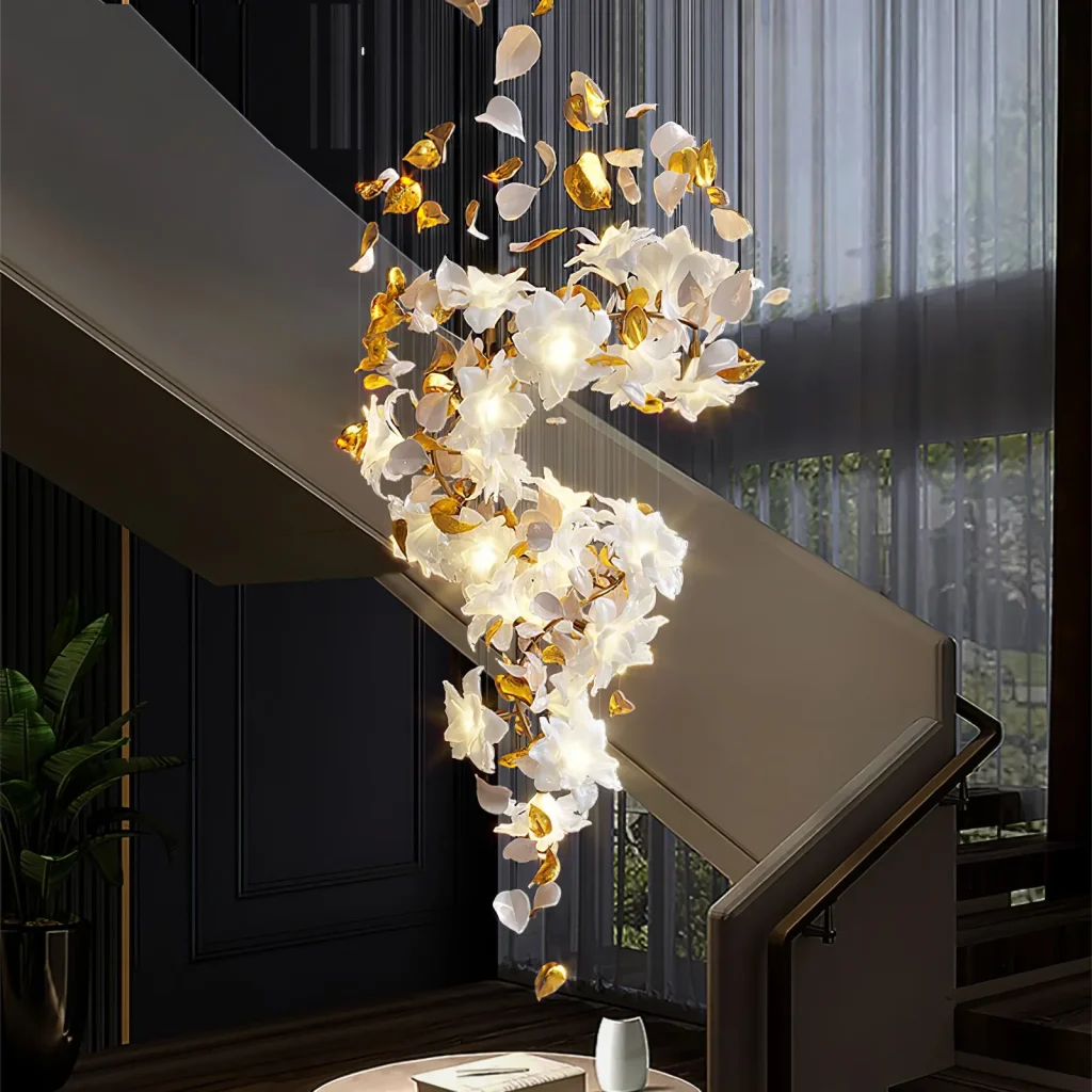
- Warm light makes materials look more textured; marble, wood veneer, and fabric materials will appear more upscale.
- Neutral light is more suitable for product display. It does not deviate from the intended color or exaggerate the image, and the product colors are reproduced with high fidelity.
- Cool light enhances the “cleanliness” of a space. Commonly used in hospitals, clinics, and technology brand stores, it gives a “professional and reliable” impression.
In other words, color temperature changes the color, texture, and three-dimensionality of a space, which is equivalent to changing “the space itself”.
3. Conclusion: Make color temperature a competitive advantage for your projects
Color temperature is not just a technical parameter—it’s a strategic design tool that shapes emotion, efficiency, and brand perception in every commercial space. Whether you’re planning a hotel, retail complex, office building, or healthcare facility, choosing the right color temperature can directly improve user experience, enhance spatial aesthetics, and increase project value.
At NewstarLamp, we support B2B clients with precise lighting solutions tailored to real-world project requirements. From warm hospitality environments to high-efficiency workspaces, we help you “design with light” in a way that is functional, reliable, and visually impactful.